About a month ago, Giovanni gave an informative talk titled ?Design and Thought ? Psychology and User Experience? at the Charlotte UX Meetup. The basis of his talk boiled down to how we logically apply aesthetics, complexity, affordance, and focus?to a design problem to create intuitive user experiences.
Aesthetics

Giovanni?identifies?two types of aesthetics. The first type of aesthetic is surface beauty and can be safely called ?style.? It?s the aesthetic of attraction and is essentially, at least in the realm of design, an application of the principles of design. The second type of aesthetic is based upon the idea of mathematical elegance. It?s generally dependent upon a process or solution ? it?s the aesthetic of economy and succinctness.?Einstein?s?E=MC2 is an example of the aesthetic of elegance because it is an economical, succinct explanation to a complex idea.
Marcel Duchamp?s Nude Descending a Staircase is a fantastic example of both understandings of aesthetic. It is a beautiful painting, full of energy and lush color. It?s also an elegant solution to the problem of showing a time lapse action with a two dimensional, static image.
Affordance
The Design of Everyday Things, by Donald Norman, outlines cases where the understanding of how to use a thing is inherently built into how it looks. Examples of such affordances are flat plates on doors that are meant to be pushed, and handles on doors that are meant to be pulled. He also talked about direct mapping ? ex: the light switch is on the light.
Complexity
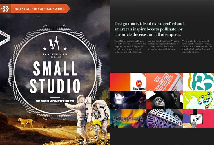
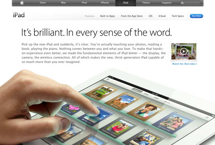
One of the papers Gio cited proposed the idea that it?s?easier for people to compartmentalize and tell one thing from another when some of the visuals are distinct and unique. Consistent visual language and structure are important. However, it?s necessary to incorporate some visual complexity to draw interest and direct a user?s attention. A couple of sites mentioned were kyan.com and apple.com.

The Kyan site is a balance between complexity imagery and a demonstration of creative drive. It?s almost entirely image based, the focus being specific on the center image, and the animated transitions between each panel.?On Apple?s iPad page, text is well balanced with simple animations and visual demonstrations of complex interactions with the iPad. There?s a fair amount of explanatory copy, but the hand doing the action on the iPad removes the need to read the text explanations.
In this case, the motion causes focus and demonstrates the proper way to interface with the device. Its a great example of the ?show, don?t tell? principle.
Resources
While there is some great anecdotal reference out there that gives insight and learning to the psychology of design, there?s not as much academic research. Here are a few papers Giovanni referenced to try to bridge that gap:
sweet potato pie sweet potato pie twas the night before christmas norad santa epic beard man nfl standings giants vs jets
No comments:
Post a Comment
Note: Only a member of this blog may post a comment.